Let's get a perspective on our overall energy mix as it stands today.
I've included a few charts from the U.S. Department of Energy 2014 Renewable Energy Data Book. [1]
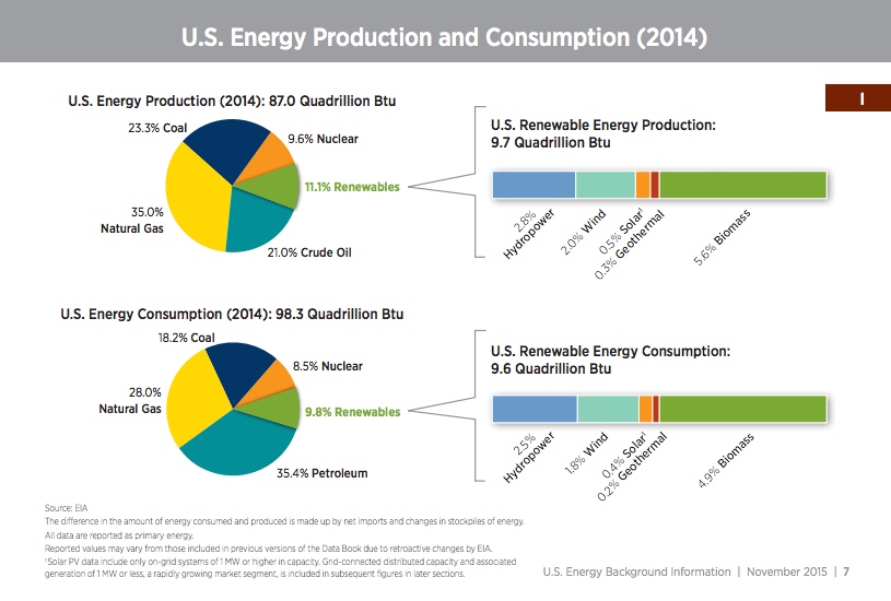
The charts below show the mix for total energy production and total consumption. I think the consumption chart is the most relevant because if we are trying to reduce CO2, we need to look at the energy we consume.

Did you notice that Biomass is a large part of Renewable? Biomass is the burning of wood.
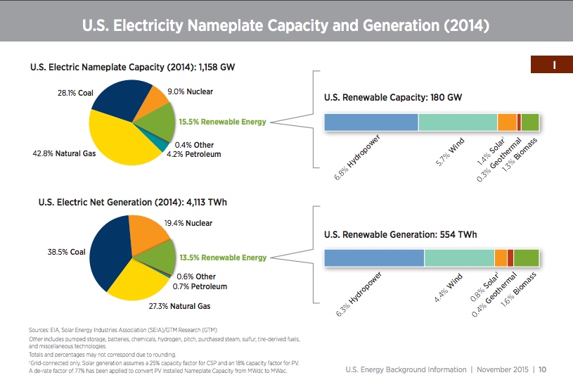
The charts below show the Electricity Nameplate Capacity and the Electricity Net Generation. I think the Net Generation is the most relevant because that is the energy actually produced. Capacity is the rating the plant can produce at peak capacity.


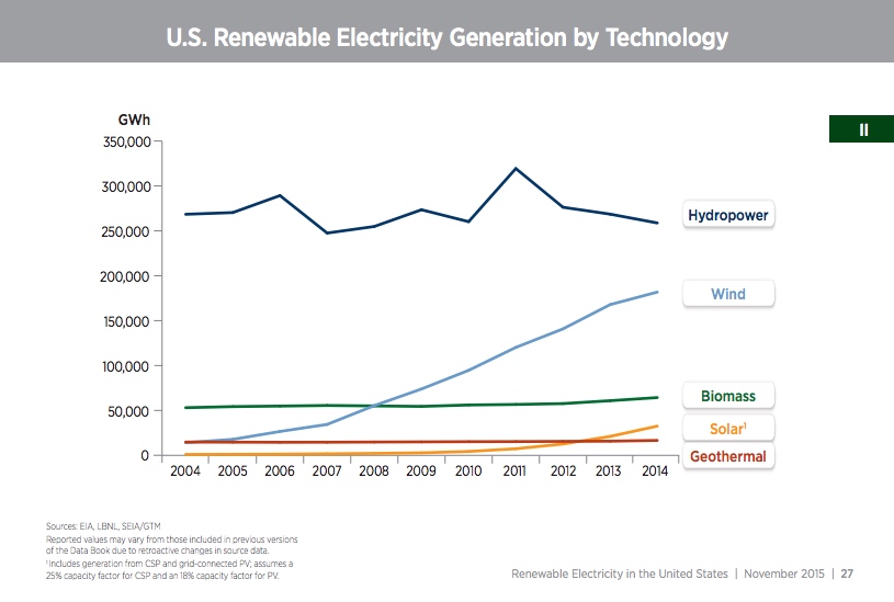
It is interesting to note that when most people talk about Renewable energy, they usually mean Wind and Solar. However, the chart above shows that Hydropower is by far the largest Renewable contributor.